Cooking Mama
Web Development Project
UC San Diego (COGS 120 – Interaction Design Course)
Project Overview
For an Interaction Design class at UC San Diego, I worked with a team of three to research, design, and develop a mobile web app over the span of 10 weeks (Jan-March 2020), Through this process we would all have learned the steps of starting an app to selling the app to the user. From web development to product design to presenting the app to a panel.
Our app is called Cooking Mama, we wanted to make a web app that would help students like ourselves learn to pick up cooking on our own in the most seamless way possible. Our goal is to create an app that has everything the user needs in one place so that they would never have to touch their phone while cooking.
Problem Statement:
“How many cups of soy sauce do I need again?”
“How long do I have to let this simmer again?”
“How hot do I have to set the oven again?”
“Aw man, I gotta touch my screen with hands covered in chicken remains.”
As an amateur cook, these are the thoughts I have every time I try to learn a new recipe. Constantly going back and forth between looking at my phone and cooking doesn’t allow me to really focus on creating the best meal I can make.
Research/ Need-finding
We started our project off by conducting need-finding in order to figure out what people would be looking for in a cooking assistant app. Our team also wanted to find out, at what point in cooking do people run into issues. We could figure out tangible solutions that our app could provide. To do this, we conducted several interviews around our college campus, asking open-ended questions, such as: Now that you live off campus, how is your experience with cooking for yourself?
To begin designing our app, we wanted to look at popular pre-existing designs from apps that many from our target audience use. We looked at the mobile designs from websites like Yelp, Allrecipes, and Food Network.
Storyboards
After gathering the information we learned from need-finding and research, our group created three storyboards that reflected real-life scenarios where our app would be useful.
Storyboard 1
Helps user decide what to eat based on what user has recently eaten.
Storyboard 2
Text to speech function allows user to cook without touching phone.
Storyboard 3
Inexperienced cook learns a new recipe from the app.
Prototyping
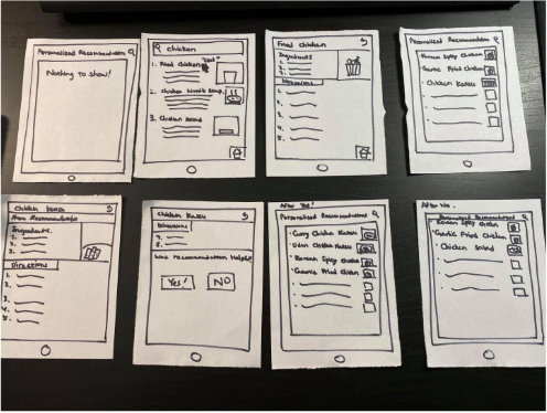
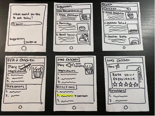
Our team wanted a design that would be user friendly, and include all the features we included in our storyboard. We started the design process with paper prototypes, so we could come up with designs and redesigns with more ease than with digital prototypes.
Each team member started with creating their own prototypes, and we continued to add features and designs we liked from each other's prototypes until we came up with a prototype we were happy with.
Iteration 1
A more basic design that included the functions of the app, but UI was not heavily considered
Iteration 2
After figuring out how we want to layout the app, and where to put its functionalities, we focused on the design of the app.
Wireframe
After completing a paper prototype we were happy with, in both design and functionality, we continued by translating our paper prototypes to a digital form. We started with a mid-fidelity design we created using figma.
Home Page
A preset list of food items the user could choose to cook from
Recipe Page
Displays everything that is necessary for the user to cook the dish
User Testing
We started our user testing process, by picking out a three people that were in our target market and had them test out our app. We used Neilsen’s 10 Design Heuristics as a guideline for the testers to evaluate and give feedback of our app’s design.
We tested the user on any slips they might have on the home page
Testing the user on how easy it was to add a recipe
Our team wanted to test how practical our app is, in a real environment
A/B Testing
After gathering this feedback we made a version of the app to include some suggested changes, such as a larger ‘add recipe ‘ icon, and larger thumbnails for food items . We took to A/B testing through Google Analytics to see if these changes would significantly improve the user experience. We were able to obtain results from 40 different users for this test.
Our results showed that the suggested changes would be a good addition to our app and we decided to make our ‘add recipe’ button larger and the size of the recipe thumbnail larger, so the user would not accidentally mis-press it, and several other small changes to make the UI more friendly.
Final Product
By the end of the 10 weeks, our team was able to fully implement the main features of the app, like the text to speech function that followed along with the current step that the user was on, and an ‘add recipe’ function that would permanently create a thumbnail for whichever food item that the user wants to the home page.


